CHEATCODE REBRANDING
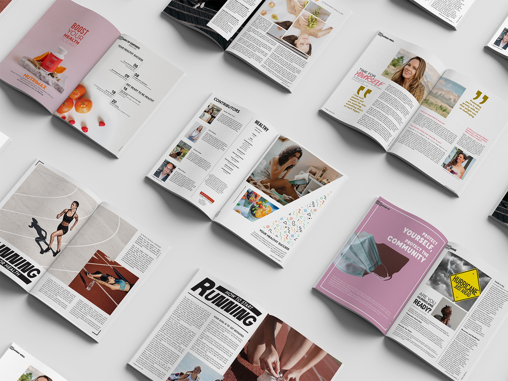
This project involved designing a complete layout for Healthy Magazine, a publication focused on health, wellness, and balanced living. The goal was to create a visually engaging and structured design that enhances readability while reinforcing the magazine’s mission of providing accessible, informative, and inspiring content.
OVERVIEW
Background
Healthy Magazine aims to educate and inspire readers about fitness, nutrition, and mental well-being. The redesign needed to establish a clean, structured, and engaging visual identity that enhances readability and encourages user engagement.
Problem Statement
The existing magazine layout lacked a clear hierarchy. Typography choices did not fully align with the magazine’s brand, and there was a need for a more cohesive design system that would improve the overall reading experience.
Key Findings
- Readers prefer a clean, well-structured layout that makes information easy to digest
- A refined typography system was necessary to balance aesthetics and readability
- Effective use of imagery and white space helps create an inviting and visually appealing reading experience


